Plotting ICA components
We use ICA to remove/subtract artifacts. ICA may also be used to find brain sources. In this section of the tutorial, we will assess which components contribute the most to the data.
Table of contents
Component spectra contribution
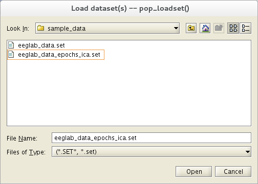
We use here the tutorial dataset as it was after extracting data epochs. Select the File → load existing dataset menu item and select the tutorial file “eeglab_data_epochs_ica.set” located in the “sample_data” folder of EEGLAB. Then press Open.
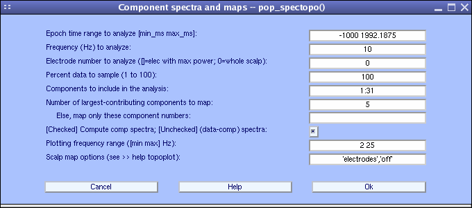
It is of interest to see which components contribute most strongly to which frequencies in the data. To do so, select Plot → Component spectra and maps. This calls the pop_spectopo.m function.
The first input is the epoch time range to consider. The fourth input is the percentage of the data to sample at random (smaller percentages speeding the computation, larger percentages being more definitive). Since our EEG dataset is fairly small, we choose to change this value to 100 (= all of the data). We will then visualize which components contribute the most at 10 Hz, entering 10 in the Scalp map frequency text box. We want to scan all components, so use the default in Components to consider. Press Ok.
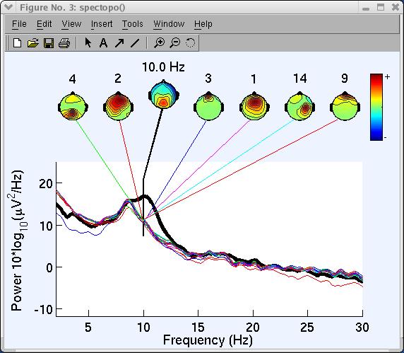
The spectopo.m window (below) appears.
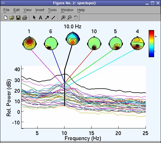
In the previous window, we plotted the spectra of each component.
A more accurate strategy is to plot the data signal minus the component activity and estimate the decrease in power in comparison to the original signal at one channel - it is also possible to do this for all channels, but it requires to compute the spectrum of the projection of each component at each channel which is computationally intensive.
To do so, go back to the previous interactive window:
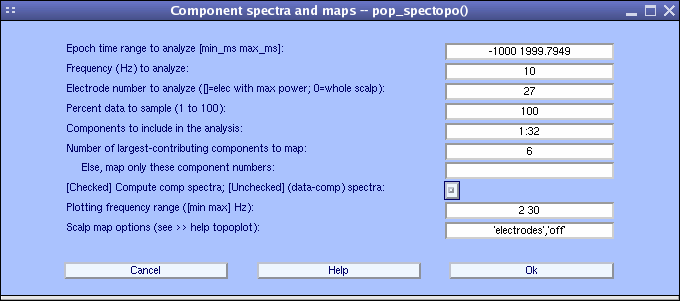
- Choose explicitly to plot component’s contribution at channel 27 (POz) where power appears to be maximum at 10 Hz using the Electrode number to analyze …: field,
- Uncheck the checkbox [checked] compute component spectra….
- Set percent to 100 as before.
- Display 6 component maps instead of 5 (default) (note that all component spectra will be shown)
- Set the maximum frequency to be plotted at 30 Hz using the Plotting frequency range option in the bottom panel (below).
- Press Ok when done.
The spectopo.m figure appears (as below).
 x
x
The following text is displayed on the MATLAB command line:
    Component 1 percent variance accounted for: 3.07
    Component 2 percent variance accounted for: 3.60
    Component 3 percent variance accounted for: -0.05
    Component 4 percent variance accounted for: 5.97
    Component 5 percent variance accounted for: 28.24
    Component 6 percent variance accounted for: 6.15
    Component 7 percent variance accounted for: 12.68
    Component 8 percent variance accounted for: -0.03
    Component 9 percent variance accounted for: 5.04
    Component 10 percent variance accounted for: 52.08
    Component 11 percent variance accounted for: 0.79
    ....
“Percent variance accounted for” (pvaf) compares the variance of the data minus the (back-projected) component to the variance of the whole data. Thus, if one component accounts for all the data, the data minus the component back-projection will be 0, and pvaf will be 100%. If the component has zero variance, it accounts for none of the data, and pvaf = 0%. Pvaf may be larger than 100% (meaning: “If you remove this component, spectral power actually get larger, not smaller!”). According to the variance accounted for output above, component 10 accounts for more than 50% of power at 10 Hz for channel POz. Note: A channel number has to be entered or component contributions will not be computed.
Component ERP contributions
After seeing which components contribute to frequency bands of interest, it is interesting to look at which components contribute the most to the ERP.
The first step is to visualize component ERPs. To Plot component ERPs, select Plot → Component ERPs → In rectangular array, which calls the pop_plotdata.m function. Then press Ok.
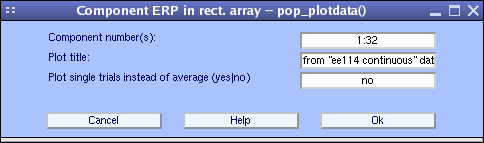
The pop_plotdata.m window below pops up, showing the average ERP for all 31 components.
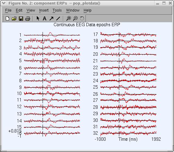
Click on the component-1 trace (above) to plot this trace in a new window (as below).
To plot the contribution of component ERPs to the data ERP, select Plot → Component ERPs → with component maps, which calls the pop_envtopo.m function. Simply press Ok to plot the 7 components that contribute the most to the dataset’s average ERP. Note that artifactual components can be subtracted from the data before plotting the ERP using the Indices of components to subtract … edit box. Press Ok.
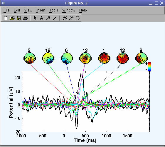
In the pop_envtopo.m plot (below), the thick black line indicates the data envelope (i.e., minimum and maximum of all channels at every time point), and the colored show the component ERPs.
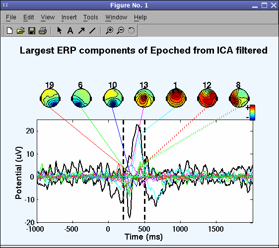
The picture above looks messy, so again call the pop_envtopo.m window and zoom in on time range from 200 ms to 500 ms post-stimulus, as indicated below.
We can see (below) that near 400 ms component 1 contributes most strongly to the ERP.
On the command line, the function also returns the percent variance accounted for by each component:
IC4 pvaf: 31.10%
IC2 pvaf: 25.02%
IC3 pvaf: 16.92%
...
Component ERP-image
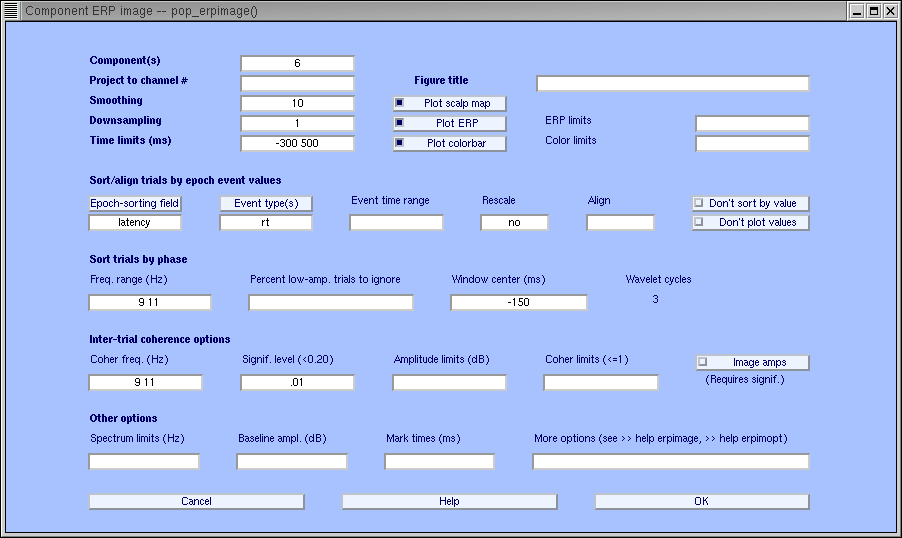
To plot ERP-image figures for component activations, select Plot → Component ERP image (calling the pop_erpimage.m function).
This function works the same as the one we used for plotting channel ERP images, but instead of visualizing activity at one electrode, the function here plots the activation of one component.
Copy the parameters in the interactive window to sort trials by phase at 10 Hz and 0 ms, to image reaction time, power and Inter-Trial Coherence (see the channel ERP image tutorial for more information).
For component 6 shown below, we observe in the pop_erpimage.m figure that phase at the analysis frequency (9Hz to 11Hz) is evenly distributed in the time window -300 to 0 ms (as indicated by the bottom trace showing the inter-trial coherence (ITC) or phase-locking factor). This component accounts for much of the EEG power at 10 Hz, but for little if any of the average ERP. Overall, the mean power at the analysis frequency does not change much across time (middle blue trace), and the phase at the analysis frequency is not reset by the stimulus (bottom blue trace). Here again, the blue-shaded regions indicate non-significant regions.
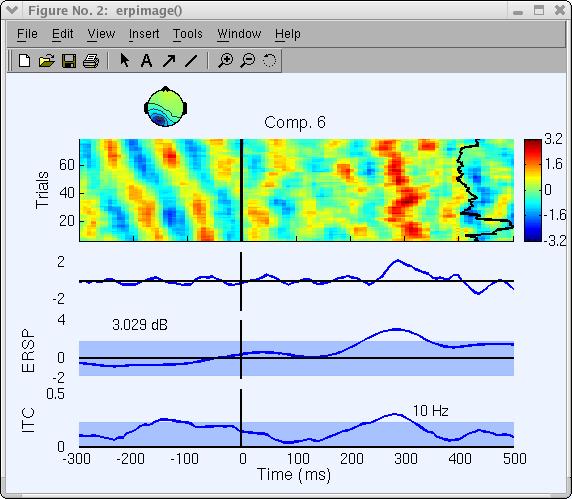
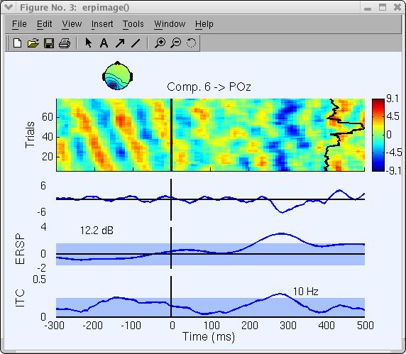
Note that the scale and polarity information is distributed in the ICA decomposition (not lost!) between the projection weights (column of the inverse weight matrix, EEG.icawinv) and rows of the component activations matrix (EEG.icaact), the absolute amplitude and polarity of component activations are meaningless and the activations have no unit of measure (though they are proportional to microvolt). To recover the absolute value and polarity of activity accounted for by one or more components at a given channel, image the back-projection of the component activation(s) at that channel:
- Go back to the previous ERP-image window
- Use the same parameters
- Set Project to channel # to 27
Note that the ERP is reversed in polarity and that the power’s unit has changed.
In the next section, we show how to use EEGLAB to perform and visualize time/frequency decompositions of independent component activations.
Component time/frequency transforms
It is potentially more interesting to look at time-frequency decompositions of component activations than at time-frequency decompositions of channel activities since some independent components may directly index one brain EEG source activity, whereas channel activities sum potentials volume-conducted different parts of the brain.
To plot a component time-frequency transform, we select Plot → Component time-frequency (calling the pop_newtimef.m function) then:
- Enter 1 for the Component number to plot
- And .05 for the Bootstrap significance level and check the FDR correct checkbox to correct for multiple comparisons using the False Discovery Rate method
- Again, we press Ok
Note: pop_newtimef.m decompositions using FFTs allow computation of lower frequencies than wavelets since they compute as low as one cycle per window, whereas the wavelet method uses a fixed number of cycles (default 3) for each frequency.
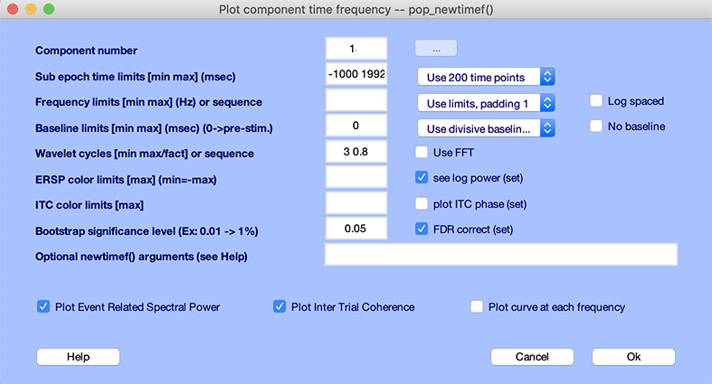
The following pop_newtimef.m window appears.
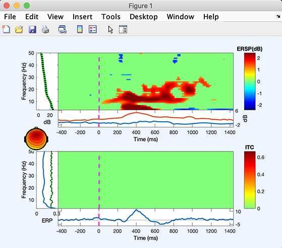
The ITC image (lower panel) shows no significant effect. The ERSP image (upper panel) shows that the 4 to 6Hz and 12 to 18Hz power increase, and then later 4 to 6Hz power increase.
Component head plots
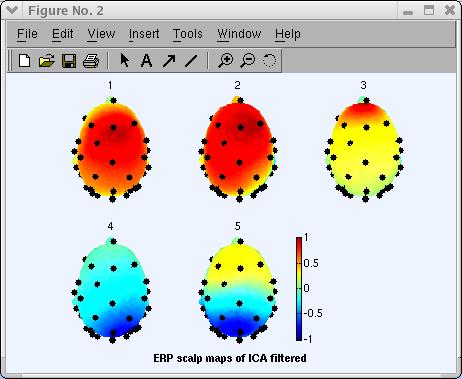
When using ICA to remove/subtract artifacts, we have plotted 2-D component scalp maps with menu item Plot → Component maps → In 2-D.
Using EEGLAB, you may also plot a 3-D head plot of a component topography by selecting Plot → Component maps → In 3-D. This calls the pop_headplot.m function. The function may automatically use the spline file you have generated when plotting ERP 3-D scalp maps. Select components 1, 2, 3, 4, 5 (below), set the heaplot options to “ ‘view’, [0 90] “ and press Ok.
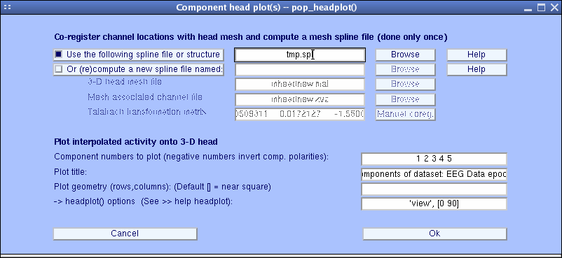
The pop_headplot.m window below appears. You may use the MATLAB rotate 3-D option to rotate these headplots. Else, enter a different view angle in the window above.
For more information on this interface and how to perform coregistration between electrodes and head models, see the Plotting ERP Data in 3-D.
Next steps
This tutorial only gives a rough idea of the utility of EEGLAB for processing single-trial and averaged EEG or other electrophysiological data. The analyses of the sample dataset(s) presented here are by no way definitive. One should carefully examine each independent component’s activity and scalp map noting its dynamics and its relationship to behavior and other component activities to begin to understand its role and possible biological function.
Further questions may be more important: How are the activations of pairs of maximally independent components inter-related? How do their relationships evolve across time or change across conditions? Are independent components of different subjects related, and if so, how? EEGLAB group analysis tools a suitable environment for exploring these and other questions about brain dynamics, both for single-subject and for groups of subjects.