Plotting ERP images
Data averaging collapses the dynamic information in the data, ignoring inter-trial differences, which are large and may be crucial for understanding how the brain operates in real-time. Here, we show how to use EEGLAB to make 2-D ERP-image plots of collections of single trials, sorted by any of many possibly relevant variables. In ERP-image plots, EEG data epochs (trials) are first sorted along some relevant dimension (for example, subject reaction times, within-trial theta power levels, mean voltage in a given latency window, alpha phase at stimulus onset, or etc.), then (optionally) smoothed across neighboring trials, and finally color-coded and visualized as a 2-D rectangular color (or monochrome) image. For more background information on how to build ERP images, please refer to the Concept guide.
Table of contents
Basic plotting options
We use here the tutorial dataset as it was after extracting data epochs. Select the File → load existing dataset menu item and select the tutorial file “eeglab_data_epochs_ica.set” located in the “sample_data” folder of EEGLAB. Then press Open. To plot an ERP image, we must first choose a channel to plot. This is best done when plotting ERPs. In this section of the tutorial, we will use the POz occipital channel (index 27).
Plotting a raw ERP image
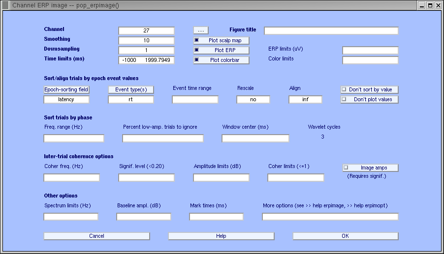
Select Plot → Channel ERP image. This brings up the pop_erpimage.m window (below).
Enter the channel number (27 or click on the “…” button to select channel POz), a trial-smoothing value of 1, and press Ok.

An ERP image is a rectangular colored image in which every horizontal line represents activity occurring in a single experimental trial (or a vertical moving average of adjacent single trials). By stacking above each other the color-sequence lines for all trials in a dataset, we produce an ERP image. See the Appendix for more details on how ERP images are constructed.
In the standard erpimage.m output figure (below), the trace below the ERP image shows the average of the single-trial activity, i.e. the ERP average of the imaged data epochs.
The head plot (top left) containing a red dot indicates the position of the selected channel in the montage. Both of these plotting features (as well as several others) can be turned off in the pop_erpimage.m pop-up window (above). See checkboxes plot ERP and plot scalp map.
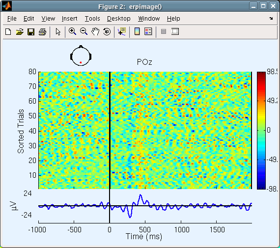
Since activity in single trials contains many variations, it may be useful to smooth the activity (vertically) across neighboring trials using a rectangular (boxcar) moving average.
Plotting a smoothed ERP image
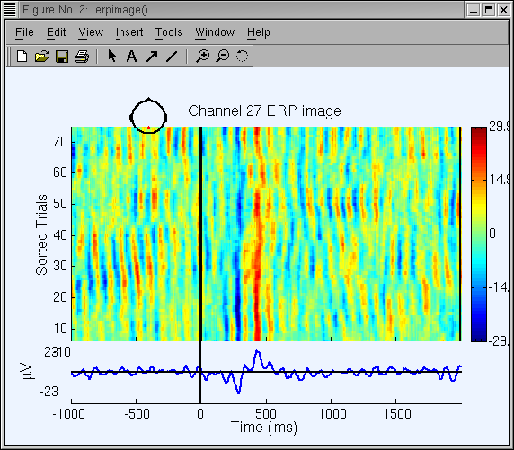
Again call up the pop_erpimage.m interactive window and set the smoothing width to 10 instead of 1. Now (see below) it is easier to see the dominant alpha-band oscillations in single trials.
Note: Because of the large number of available options, parameters from the last call (if any) are recalled as defaults (though optional arguments entered via the text box are not). If you experience a problem with this feature, you may type >>eegh(0) on the MATLAB command line to clear the history.
ERP image with large numbers of trials. When plotting a large number of trials, it is not necessary to plot each (smoothed) trial as a horizontal line. (The screen and/or printer resolution may be insufficient to display them all). To reduce the imaging delay (and to decrease the saved plot file size), one can decimate some of the (smoothed) ERP-image lines. Entering 4 in the Downsampling box of the pop_erpimage.m window would decimate (reduce) the number of lines in the ERP image by a factor of 4. If the Smoothing width is (in this case) greater than 2*4 = 8, no information will be lost from the smoothed image. To image our sample dataset, it is not necessary to decimate since we have relatively few (80) trials.
Sorting trials in ERP images
In the ERP-image figures above, trials were imaged in (bottom-to-top) order of their occurrence during the experiment. It is also possible to sort them in order of any other variable that is coded as an event field belonging to each trial in the dataset.
Altogether, there are five trial sorting methods available in erpimage.m. Some methods are only available when calling erpimage.m from the command line:
- Sort by the sorting variable (sortvar command-line option). This sorts input data trials (epochs) by the sorting variable (for example, RT) input for each epoch of the input data.
- Sort by value (valsort command-line option). Here, trials are sorted in order of their mean value in a given time window. Use this option to sort by ERP size (option not available yet in the interactive window).
- Sort by amplitude (ampsort command-line option). Trials are sorted in order of spectral amplitude or power at a specified frequency and time window. Use this option to display, for example, P300 responses sorted by alpha amplitude (option not available yet in the interactive window).
- Sort by phase (phasesort command-line option). Trials are sorted in order of spectral phase in a specified time/frequency window.
- Do not sort (nosort command-line option). Display input trials in the same order they are input.
Below, we demonstrate sorting the same trials in order of response time event latency (reaction time).
Sorting trials by reaction time
Use menu item Plot → Channel ERP image to call the pop_erpimage.m window again:
- First press the button Epoch-sorting field, and select latency.
- Next, press the button Event type, and select rt.
- Enter Event time range of -200 800 ms to plot activity immediately following stimulus onsets.
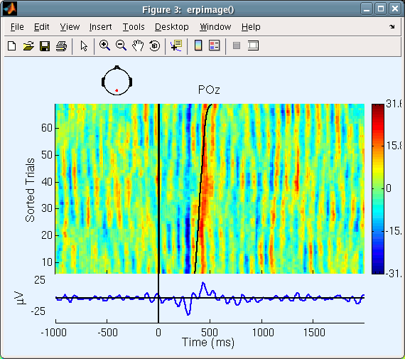
In the resulting ERP image, trials will be sorted by the latency of rt events (our sample data has one rt event per epoch; If this were not the case, erpimage.m would only have plotted epochs with rt events).
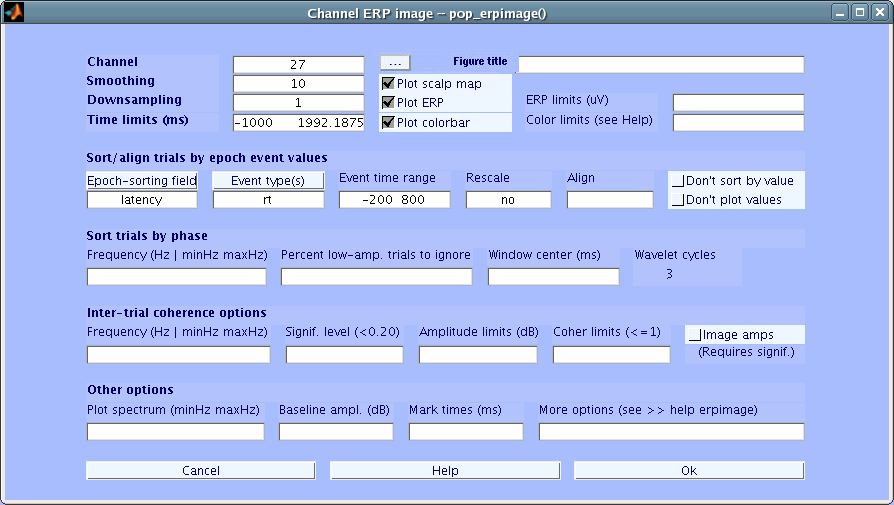
Note: In this and some other interactive pop-windows, holding the mouse cursor over the label above a text-entry box for a few seconds pops up an explanatory comment.
Now, the erpimage.m figure below appears. The curved black line corresponds to the latency time of the event (rt) we are sorting by.
In general, the user can sort on any event field value.
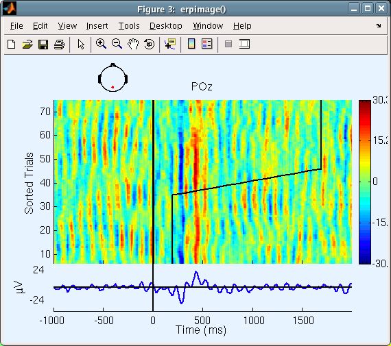
For example, call back the pop_erpimage.m window, press the Epoch-sorting Field button, and select position instead of latency. Remove rt from the Event type box. Finally, enter yes under the Rescale box. Press Ok.
In the resulting plot, trials are sorted by stimulus position (1 or 2, automatically normalized values to fit the post-stimulus space for display). Note that the smoothing width (10) is applied to both the single-trial data and to the sorting variable. This explains the oblique line connecting the low (1) and high (2) sorting variable regions.
Note: One can also enter a MATLAB expression to normalize the sorting variable explicitly (see erpimage.m help).
Using the Align parameter
Now, reselect the latency of the rt events as the trial-sorting variable (press the Epoch-sorting field button to select latency and press the Event type button to select rt). Enter no under Rescale (else, reaction times would be automatically normalized).
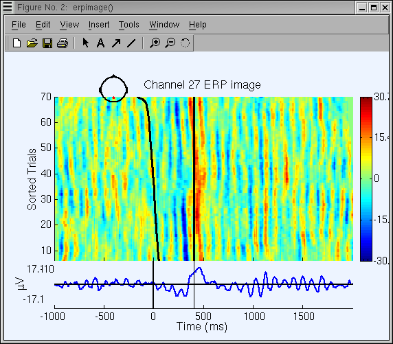
Use the Align input to re-align the single-trial data based on the sorting variable (here the reaction time) and the change time limits. The latency value given in Align will be used for specifying time 0.
To select the median of the trial-sorting values (here, median reaction time) for specifying the new time 0 (which will be at the response time minus the median reaction time), our convention is to use the MATLAB symbol for infinity (Inf) in this box, as shown below. If you want to set a different value (for instance, while plotting an ERP image for one subject, you might want to use the median reaction time you computed for all your subjects), simply enter the value in ms in the Align input box.
Note: Temporal realignment of data epochs, relative to one another, will result in missing data at the lower-left and upper-right corners of the ERP image. The ERP-image function shows these as green (0) and returns these values as NaNs (MATLAB not-a-number).
The ERP image figure (below) will be created. Here, the straight vertical line at about 400 ms post-stimulus indicates the moment of the subject response, and the curving vertical line, the time at which the stimulus was presented in each trial. Compare the figure below with the previous non-aligned, RT-sorted ERP image.
Sorting trials by EEG phase value
In a 2004 publication, we have discussed ways how the event-related EEG dynamics occurring in a set of data epochs time-locked to some classes of events are not limited to nor completely expressed in features of their time-locked trial average or Event-Related Potential (ERP). To do this, we used phase-sorted ERP-images.
Next, we will experiment with sorting trials by their EEG phase value in a specified time/frequency window. Though rt values can be shown in phase-sorted ERP-image figures, we will omit them for simplicity.
To do this, return to the pop_erpimage.m window from the menu:
- Enter -200 800 next to Time limits (ms) to zoom in on the period near stimulus onset
- Clear the contents of the Sort/align trials by epoch event values fields Epoch-sorting field, Event type(s) and Align inputs
then in the Sort trials by phase section, complete the following fields as indicated:
- Sort trials by phase → Frequency: 10 (Hz)
- Sort trials by phase → Window center: 0(ms)
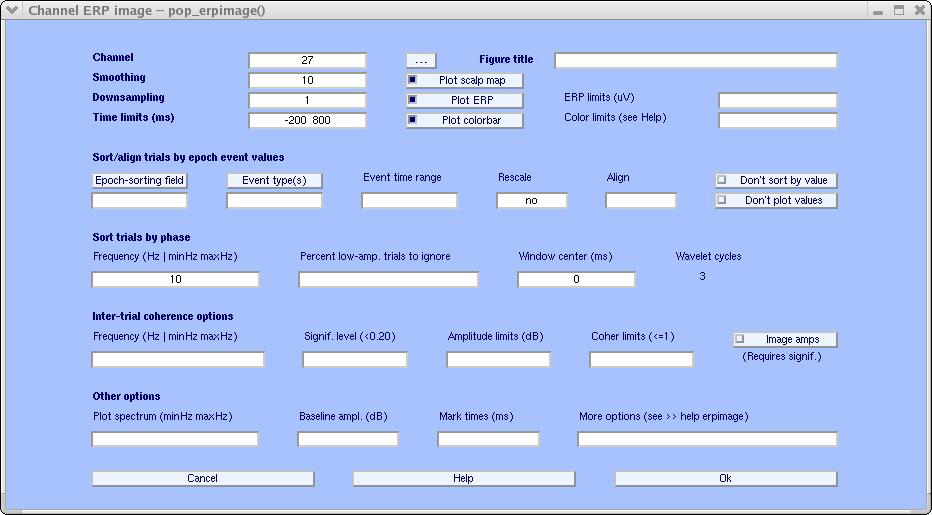
We then obtain the ERP-image figure below.
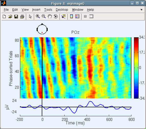
Note that the activity before the stimulus onset the oblique red stripe is produced by phase sorting: the phase (i.e., the latency of the wave peaks) is uniformly distributed across the re-sorted trials.
In this computation, a 3-cycle 10 Hz wavelet was applied to a window in each trial centered at time 0. The width of the wavelet was 300 ms (i.e., three 10-Hz cycles of 100 ms). Therefore, it extended from -150 ms to 150 ms. After the wavelet was applied to each trial, the function sorted the trials in order of the phase values (-pi to pi) and displayed an ERP image of the trials in this (bottom-to-top) order. The dominance of circa 10-Hz activity in the trials, together with the 10-trial smoothing we applied, makes the phase coherence between adjacent trials obvious in this view.
Phase-sorted ERP images using different time and frequency windows represent different paths to fly through complex (single-channel) EEG data. We could have applied phase-sorting of trials using any time/frequency window. The results would depend on the strength of the selected frequency in the data, particularly on its degree of momentum (i.e., did the data exhibit long bursts at this frequency), and its phase-locking (or not) to experimental events.
To see the phase sorting more clearly, keep the same settings, but this time enter 50 under percent low-amp. trials to ignore. Here, the 50% of trials with the lowest 10-Hz (alpha) power in the selected time window will be rejected; only the other 40 trials (larger-alpha 50%) will be imaged. Here (below), we can better see how the alpha wave seems to resynchronize following the stimulus. Before time 0, the alpha phase is more or less random (uniformly distributed), and there is little activity in the average ERP. At about 200 ms, alpha activity seems to (partially) synchronize with the stimulus, and an N300 and P400 ERP appears.
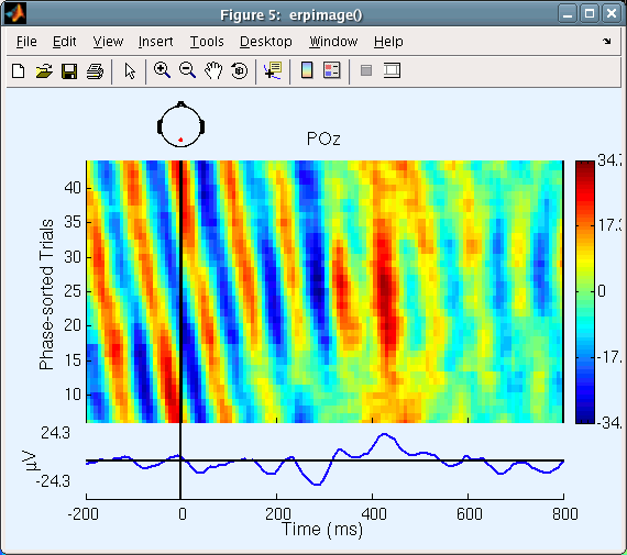
Our interpretation (above) of these trials as representing phase synchronization need not be based on visual impression alone. To statistically assess whether the alpha activity is partially resynchronized by (i.e., is partly phase-reset by) the stimuli, we need to plot the phase coherence (or phase-locking factor) between the stimulus sequence and the post-stimulus data.
This measure, the Inter-Trial Coherence (ITC) our terminology, takes values between 0 and 1. A value of 1 for the time-frequency window of interest indicates that the alpha phase (in this latency window) is constant in every trial. A value of 0 occurs when the phase values in all trials are uniformly distributed around the unit circle. In practice, values somewhat larger than 0 are expected for any finite number of randomly phase-distributed trials.
Plotting Inter-Trial Coherence ERP images
Inter-Trial Coherence (ITC) is defined and described in detail in the time-frequency decomposition section of the tutorial and in the online tutorial.
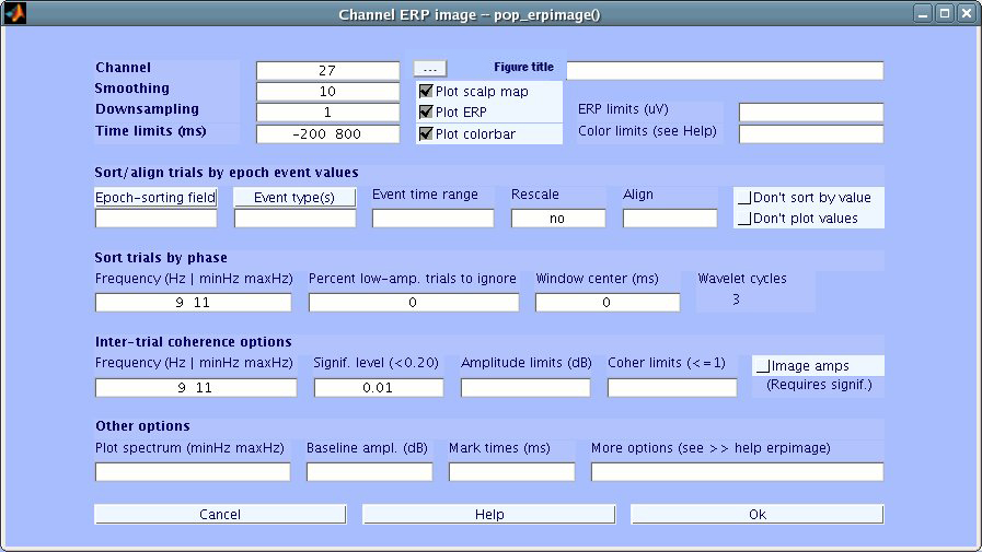
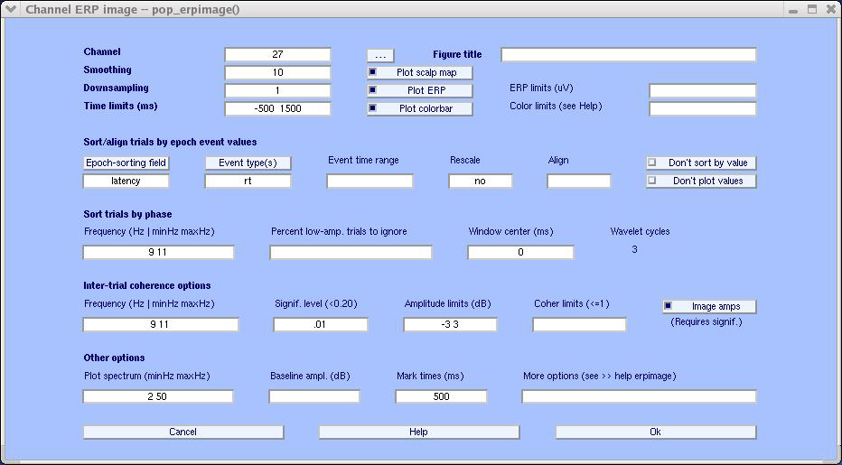
To plot the ITC in our ERP-image figure, we choose to enter the following parameters in the pop_erpimage.m window:
- Omit the Percent low-amp. of Trials to ignore value (or enter 0)
- Under Sort trials by phase → Frequency enter 9 11
- Also enter 9 11 in the Inter-TrialCoherence → Frequency box
- Enter 0.01 under Signif. level. This value is NOT corrected for multiple comparisons.
Then, press Ok.
Note that these two entries must be equal (the window actually prevents the user from entering different values). Entering a frequency range instead of one frequency (e.g., 10 as before) tells erpimage.m to find the data frequency with maximum power in the input data (here between 9 and 11 Hz).
The following window is created.
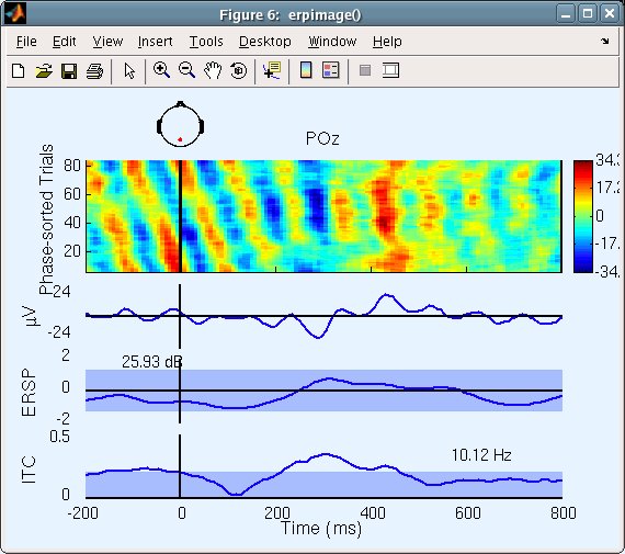
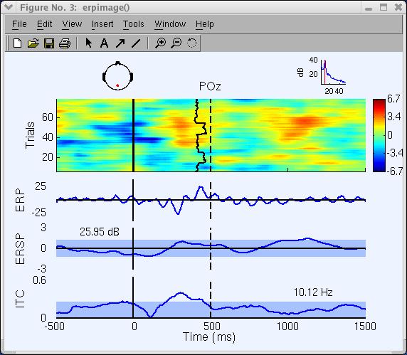
Two additional plot panels appear below the ERP panel (µV). The middle panel, labeled ERSP for Event-Related Spectral Power, shows mean changes in power across the epochs in dB. The blue region indicates 1% confidence limits according to surrogate data drawn from random windows in the baseline. Here, power at the selected frequency (10.12 Hz) shows no significant variations across the epoch.
The number 25.93 dB in the baseline of this panel indicates the absolute baseline power level. To compare results, it is sometimes useful to set this value manually in the main ERP-image pop-window.
The bottom plot panel shows the event-related Inter-Trial Coherence (ITC), which indexes the degree of phase synchronization of trials relative to stimulus presentation. The value 10.12 Hz here indicates the analysis frequency selected. Phase synchronization becomes stronger than our specified p=0.01 significance cutoff at about 300 ms.
Note: The ITC significance level is typically lower when based on more trials. Moreover, ITC is usually not related to power changes.
For a further discussion on how to interpret the results of phase sorting in ERP image plot, see the Appendix
Plotting spectral amplitude ERP images and additional options
There are several other erpimage.m options that we will briefly illustrate in the following example:
- The Image amps entry on the pop_erpimage.m window allows us to image amplitude of the signal (at the frequency of interest) in the single trials, instead of the raw signals themselves. Check this box.
- The Plot spectrum (minHz maxHz) entry adds a small power spectrum plot to the top right of the figure. Enter 2 50 to specify the frequency limits for this graph.
- Change the Epoch-sorting field box back to latency and Event type back to rt.
- Enter 500 under Mark times to plot a vertical mark at 500 ms (here for illustrative purpose only)
- Enter -500 1500 under Time limits to zoom in on a specific time window
- Enter -3 3 under Amplitude limits (dB).
The erpimage.m figure below appears.
